Introduction: You could have the most groundbreaking, life-changing video content in the history of the internet, but if your thumbnail fails, no one will ever know. In the attention economy of YouTube, the thumbnail is not just an image; it is a billboard, a promise, and the single most critical factor in your Click-Through Rate (CTR). It is the gatekeeper between your hard work and your audience.
Welcome to our comprehensive deep dive. In this article, we are going to explore the critical mechanics of visual psychology. We will move beyond simple "pretty pictures" and into strategic design—understanding how color, composition, and emotion drive human behavior in a split second.
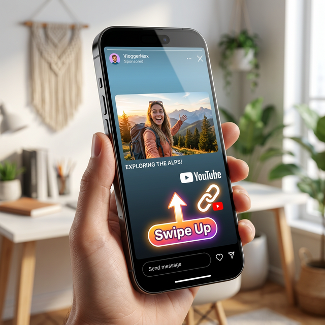
Many creators spend hours filming and editing, only to neglect the final step: distribution. When sharing links on external platforms like Instagram, TikTok, or Twitter, sending users to standard URLs often traps them in an in-app browser. This kills engagement instantly. Deep linking solutions like OpeninYoutube are specifically engineered to bypass these sandboxes, ensuring your audience lands securely in their native app where they are already logged in and primed to interact.
The Psychology of the Click
Before you open Photoshop or Canva, you must understand the battlefield. When a user scrolls through their feed, their brain processes images 60,000 times faster than text. You have less than 400 milliseconds to make an impression before they swipe past you.
This decision is emotional, not logical. Users don't click because they've analyzed the value proposition; they click because something triggered a visceral response. Curiosity, shock, fear of missing out (FOMO), or aspiration. Your thumbnail must hack this biological shortcut. It needs to scream "Stop!" without saying a word.
- The Curiosity Gap: Show something incomplete or confusing that demands an explanation.
- The Promise: Visually demonstrate the result the viewer will get if they watch.
- The Pattern Interrupt: Break the visual noise of the feed with something unexpected.
The Rule of Less is More
The biggest mistake new creators make is clutter. They try to tell the whole story in one image. They add five different objects, three lines of text, and a complex background. On a 27-inch monitor, it might look detailed. On a 5-inch smartphone screen, it looks like mud.
The Three-Element Limit
Try to limit your thumbnail to three core elements. For example:
- A face with a strong expression.
- The object of focus (e.g., a camera, a burger, a car).
- Three words of text max.
If you can't explain the thumbnail in three seconds, it's too complicated. Simplify until it hurts, then simplify more. White space is your friend. It gives the eye a place to rest and draws focus to what matters.
Color Theory and Contrast
Color is not just decoration; it is communication. Different colors evoke different emotions, but more importantly, contrast drives visibility.
Complementary Colors
Use the color wheel to your advantage. Colors opposite each other (Blue/Orange, Green/Red, Purple/Yellow) create maximum vibration and separation. If your background is blue, wear an orange shirt. If your subject is green, use a red accent.
Brightness and Saturation
YouTube is a bright platform. Dark, moody thumbnails often get lost unless they are specifically styled for horror or mystery. Generally, boosting saturation and exposure slightly helps your image pop against the white/dark mode background of the site. But be careful not to over-saturate to the point of looking artificial.
Key Insight: Red and Yellow are the most "urgent" colors in the spectrum (think McDonald's or Stop signs). Use them sparingly for call-to-action elements or key text to draw the eye immediately.
Facial Expressions and Emotion
Humans are hardwired to look at faces. We seek connection. A thumbnail with a face almost always outperforms one without, provided the expression is clear.
Eyes Are Everything
The eyes are the anchor. Ensure they are sharp, well-lit, and visible. If the subject is wearing sunglasses, consider taking them off for the thumbnail. The viewer needs to see where the subject is looking.
Mirroring Emotion
Your face should match the tone of the video. If it's a tragedy, look sad. If it's a crazy challenge, look shocked or excited. Exaggerate the expression slightly for the camera, as subtle nuances get lost on small screens. A slight smile becomes a beam; a raised eyebrow becomes shock.
Mobile-First Design
This cannot be overstated: Over 70% of watch time comes from mobile devices. If you design your thumbnails on a desktop and don't check them on a phone, you are designing for the minority.
Zoom out on your design until it is the size of a postage stamp. Can you still read the text? Can you still identify the object? If the answer is no, go back and make the elements bigger. Increase font weight. Remove background details. Design for the smallest screen first, and it will look great on the big one.
A/B Testing Your Way to Success
You are not a mind reader. What you think looks good might flop. The only truth is data. YouTube now allows native A/B testing for thumbnails, and third-party tools offer similar features.
What to Test
- Text vs. No Text: Does the image speak for itself, or does it need a caption?
- Face vs. Object: Does your personality drive clicks, or does the product?
- Emotion: Does shock perform better than happiness for this specific topic?
Run tests for at least 24-48 hours to get statistical significance. Let the data decide the winner, not your ego. Over time, you will build a personal "playbook" of what works best for your specific audience.
Conclusion
Designing custom thumbnails is a blend of art and science. It requires empathy for the viewer, an understanding of visual psychology, and a willingness to iterate based on data. It is not enough to just "make it look nice." It must work.
Remember, the thumbnail gets the click, but the content keeps the viewer. Don't fall into the trap of clickbait where the image promises something the video doesn't deliver. That destroys trust. Instead, aim for click-worthy—an honest, compelling representation of the value inside.
Master this skill, combine it with smart distribution tactics like deep linking to ensure those clicks convert seamlessly, and you will unlock a level of growth that content alone cannot achieve. Your thumbnail is your handshake with the world. Make it firm, make it memorable, and make it count.